
Essential Design Principles
1. Color Theory
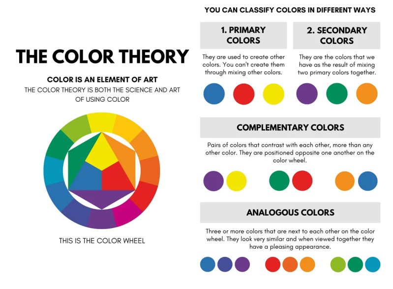
Color theory involves understanding how colors interact with each other and how they affect the overall design. It includes the study of color harmonies, the color wheel, and the emotional impact of colors.
Key Concepts:
- Primary Colors: Red, blue, and yellow. These colors cannot be created by mixing other colors.
- Secondary Colors: Green, orange, and purple. These are created by mixing two primary colors.
- Tertiary Colors: Colors formed by mixing a primary and a secondary color.
- Complementary Colors: Colors opposite each other on the color wheel, which provide high contrast and vibrant look (e.g., blue and orange).
- Analogous Colors: Colors next to each other on the color wheel, which create harmonious and pleasing designs (e.g., blue, blue-green, and green).
- Monochromatic Colors: Variations in lightness and saturation of a single color, which create a cohesive and soothing look.
Example: A design for a beach-themed poster might use complementary colors like blue (representing the ocean) and orange (representing the sunset) to create a vibrant and eye-catching contrast.
2. Typography
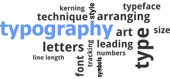
Typography is the art and technique of arranging type to make written language legible, readable, and visually appealing. It includes the choice of typefaces, point sizes, line lengths, line-spacing (leading), and letter-spacing (tracking).
Key Concepts:
- Serif vs. Sans-Serif: Serif fonts have small lines or extensions at the end of their letters (e.g., Times New Roman), while sans-serif fonts do not (e.g., Arial).
- Font Families: Groups of related fonts (e.g., Arial, Arial Bold, Arial Italic).
- Hierarchy: Using different font sizes, weights, and styles to guide the reader's eye to the most important elements first.
- Kerning: The adjustment of space between individual characters in a word.
- Leading: The space between lines of text, which can affect readability.
Example: In a website header, using a large, bold sans-serif font for the main title and a smaller, regular serif font for the subheading can create a clear visual hierarchy and improve readability.
3. Layout
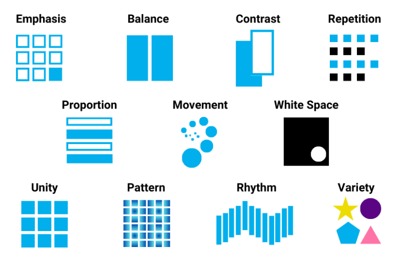
Layout refers to the arrangement of visual elements on a page. A good layout guides the viewer's eye through the design in a logical and aesthetically pleasing way.
Key Concepts:
- Grid Systems: Using a grid to organize content and create a consistent structure. Common grid layouts include the rule of thirds and the golden ratio.
- White Space: The empty space around and between elements in a design. Proper use of white space can make a design look clean and organized.
- Alignment: Aligning elements to create a clean, ordered appearance. Common types include left, right, center, and justified alignment.
- Proximity: Grouping related items together to show their connection and to declutter the design.
- Balance: Distributing elements evenly to create a sense of stability. Balance can be symmetrical or asymmetrical.
Example: A magazine spread might use a grid system to align text and images consistently, ensuring that each column and row lines up neatly. The use of white space around the images can draw attention to them, while balanced alignment keeps the layout cohesive.
Combining Principles in Design
A well-designed poster for a concert might combine all these principles:
- Color Theory: Using a vibrant, analogous color scheme with shades of purple, pink, and blue to create a lively atmosphere.
- Typography: Choosing a bold, decorative font for the band name to catch attention, paired with a clean, sans-serif font for the event details to ensure readability.
- Layout: Employing a grid system to align the text and images, with ample white space around the key elements to make the poster look uncluttered and appealing.
By understanding and applying these principles, designers can create visually appealing and effective designs that communicate their intended message clearly and attractively.
Related Products


Leave a Comment