09 Jul


Posted By
0 Comment(s)
2017 View(s)
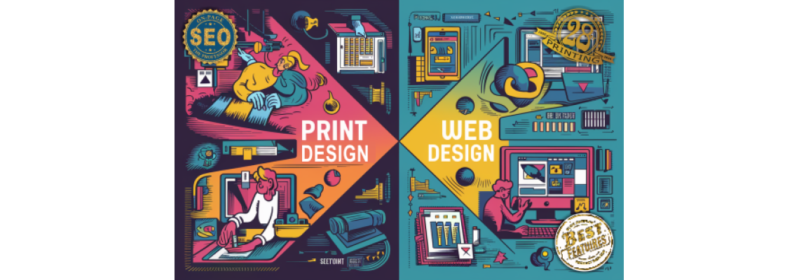
When designing for print versus the web, there are several key differences and considerations to keep in mind. Here are the main points to consider:
1. Resolution
- Print: Requires high resolution (typically 300 DPI or higher) to ensure clarity and detail. Images need to be sharp to look good when printed.
- Web: Requires lower resolution (typically 72-96 DPI) since screens have a lower pixel density compared to print. Higher resolution images can slow down web pages.
2. Color Mode
- Print: Uses CMYK (Cyan, Magenta, Yellow, Black) color mode. This color model is used in printing because it aligns with the way printers mix inks.
- Web: Uses RGB (Red, Green, Blue) color mode. Screens display colors through light, which is best represented by RGB.
3. File Format
- Print: Preferred file formats are typically lossless and high quality, such as TIFF, EPS, PDF, and sometimes high-resolution JPEG. These formats ensure the best quality output.
- Web: Preferred file formats are usually optimized for faster loading times and smaller file sizes, such as JPEG, PNG, GIF, and SVG.
4. Color Accuracy
- Print: Requires precise color matching, often achieved through color proofs and calibration. Colors can vary between different printers and paper types.
- Web: Color accuracy can vary depending on the user's screen and its settings. Designers often use web-safe colors and test designs on multiple devices.
5. Typography
- Print: Offers more control over typography. Designers can use a wider range of fonts, sizes, and layouts without worrying about compatibility.
- Web: Limited by web-safe fonts and requires consideration for different screen sizes and resolutions. Responsive design ensures readability across devices.
6. Layout and Dimensions
- Print: Fixed dimensions and layouts. Designers must consider bleed, trim, and safe areas to ensure no important content is cut off.
- Web: Flexible layouts that must adapt to different screen sizes and resolutions. Responsive and fluid design principles are crucial for a good user experience.
7. Interactivity
- Print: Static medium with no interactivity. Everything is designed to be read or viewed as is.
- Web: Highly interactive, including links, animations, videos, and other dynamic content. Designers need to consider user interaction and experience.
8. File Size and Optimization
- Print: File size is less of a concern as long as it ensures high quality. However, files need to be manageable for printers and may be compressed for easier handling.
- Web: File size is a major concern due to loading times and bandwidth. Images and media need to be optimized for quick loading without sacrificing too much quality.
9. Audience Reach and Accessibility
- Print: Limited to the physical distribution of printed materials. Accessibility considerations include font size and readability.
- Web: Potentially global reach. Accessibility considerations include screen reader compatibility, contrast ratios, and responsive design for different devices.
10. Revisions and Updates
- Print: Changes after printing can be costly and time-consuming. Multiple proofs and checks are usually necessary before final printing.
- Web: Changes can be made easily and quickly, often in real-time. This allows for continuous updates and improvements.
Summary
When designing for print, the focus is on high resolution, precise color matching, and static layouts. For web design, the emphasis is on flexibility, interactivity, and optimization for various devices and screen sizes. Understanding these differences helps create effective and visually appealing designs tailored to the intended medium.

Leave a Comment